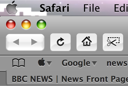
After a bit more digging around, I’ve basically found two major apps that sit at either end of the RI-ready spectrum. First off, Safari seems to be very well prepared for when the RI switch is flicked (just need to sort out those Bookmark bar triangles!):

(click to enlarge)
Notice how the button style actually changes: at 72 dpi, the buttons are more metallic than at 216 dpi (above) where they have a more “Aqua-esque” appearance.
iTunes, on the other hand, is just “magnifying” its entire interface rather than using genuine scaling. It’s also using Tiger-style window widgets:

(click for full screenshot; 2180 × 1652)
So, all in all, a decidedly mixed bag…