CoreUI

I’ve been away for a few days, so I’m a bit behind on some of the newly-discovered Leopard goodies, but one of the most impressive revelations I’ve noticed is CoreUI which, as it happens, follows on nicely from my previous post on the state of resolution independence in Leopard.

Core UI is a private Apple framework that appeared in Leopard and can be found here: /System/Library/PrivateFrameworks/CoreUI.framework. The copyright information for the framework reads “© Apple, 2005” so it would seem that it’s something Apple engineers have been working on for the majority of Leopard’s development cycle. And understandably so.

In the framework’s Resources folder, there are two bundles (AquaUI.bundle and LeopardUI.bundle), a couple of binary files (ArtFile.bin and SArtFile.bin) and the usual framework paraphernalia. The two bundles each contain two folders named Resources and Recipes along with the usual “bundley” files Info.plist and version.plist.

Contained within each of the two folders is something quite brilliant: Recipes contains XML-formatted definitions of pretty much every standard UI element in the OS and Resources contains a combination of PDFs and PNGs to support the “recipes”. The PDFs and PNGs are mostly textures and arrows, in various colours and directions respectively. Here’s an image of the contents of the Resources folder (courtesy of IKImageBrowserView!):
coreuiaquaresourcessmall.png
(click to enlarge)

The XML “recipes” are quite incredible, describing each UI element in exquisite detail. The files contain such elements as “outsideShadowBlurRadius”, “inlayMaterialName” and “figureBlendMode”. As an example, the file “scrollbars.xml” has an element named “subnodes” that has the following child elements: arrows, columnsizer, thumb and track. Each of these child elements in turn have their own “properties” child elements which define the appearance of each part of a scrollbar (in both regular and mini sizes).

The immediate question that sprung to my mind was how, exactly, these files were created. And I think an Apple patent filed on December 21st 2006 answers this question nicely. The patent is titled “Resolution Independent User Interface Design” and starts with the following abstract:

Graphical user interface material map objects are specified by a collection of attribute-value pairs, the collection of which comprises a complete description of the material map and may be used by a rendering engine to create a visual representation of the material map at any resolution.

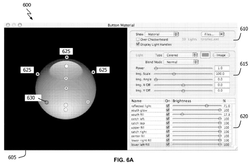
The whole patent is linked to above, but here’s the best screenshot taken from it, showing Apple’s (currently private) program for designing resolution independent interface elements:
interfacedesigner.jpg
(click to enlarge)

Just from this screenshot, we can see that the interface offers up a lot of the power of Quartz and Core Image when creating new interface elements including opacity, blend modes and custom lighting. I assume that the XML widget definitions in Leopard were made using some incarnation of this application and I’d like to think that Apple will eventually release it to developers who might currently be fretting over the best tools for making their apps resolution independent.

Leopard’s resolution (in)dependence

I’ve noticed that a lot of people on the various Mac forums are interested to know what happened to resolution independence (RI) in Leopard.

Well, having poked around a little today, I can say that support for RI is considerably better than it was in Tiger. In fact, here’s a screenshot of QuickTime Player running at 216 dpi:
quicktimeresind.png
(click for full size version)

The Dock also works very well, proudly showing off the new 512 x 512 icons:
dockresind.png
(click for full size version)

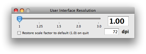
So it’s looking pretty good so far. However, the experience of resolution switching is, by all accounts, not very Apple-like. At the moment, the screen resolution is changed using the Quartz Debug application included in the Developer Tools:
qd.png
This looks fairly user friendly: drag the slider to change the screen resolution. However, on dragging the slider all that happens is a Dock restart; running applications are unaffected by the change and have to be quit and restarted in order to honour the new settings.

Once apps are restarted, system-supplied widgets seem to look pretty good on the whole: check boxes, buttons, sliders, radio buttons, text fields, segmented controls, tabs and lists all look extremely sharp. The most prominent graphical glitch in the standard Cocoa controls is with drop down menus, which have a slight drawing problem as shown here (at 144 dpi):
menu-drawing-glitch.png
(click for full size version)

So there’s clearly been substantial progress in this area since Tiger, but the (rather large) remaining problem is the extensive reliance on bitmap images for custom controls. Looking in the resources folder for Photo Booth, for example, reveals over 100 bitmaps which obviously will not scale well to higher resolutions.

To gauge the extent of bitmap-based controls beyond Photo Booth, I’ve had a look in a fair few application packages today and I’d say there’s still a huge amount of “vectorisation” left to do before Apple would consider going prime time with RI. So much so, in fact, that I’d say we won’t see it exposed in System Preferences until Mac OS X 10.7 Feral Alley Cat.

Quartz Composer goodness

Delving into Leopard’s /Developer folder shows that Apple has spent a lot of time writing sample apps for developers to play around with to get to grips with the massive number of additions. In particular, a lot of work has clearly gone into Quartz Composer, whose headline feature is support for custom patches, including those written in GLSL.

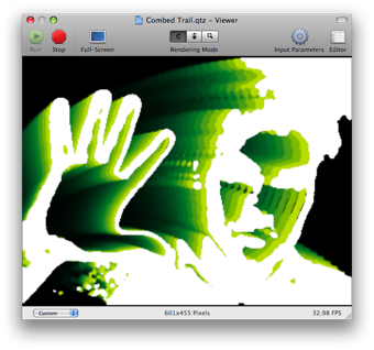
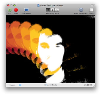
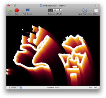
Here’s some examples of some of the sample compositions that make use of the iSight camera:
qc1.png
qc2.png
qc3.png
qc4.png

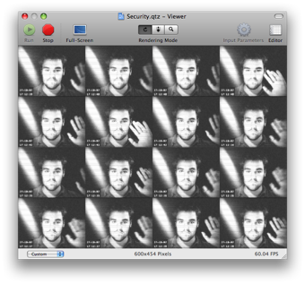
I think the last one, called “Security”, was included as a screensaver in some of the earlier development builds. There’s a surprising amount to be found in the developer tools!

On the subject of Quartz Composer, Leopard now includes a large number of “default” compositions in /System/Library/Compositions/. I’m not sure what these are for, but they seem to encompass a lot of image units embodied in QC compositions. The new iTunes visualisers are also in there, along with all 40 Mb of Photo Booth movies. I was a little surprised by that, as obviously it means you can’t free up that 40 Mb of space by just deleting PhotoBooth.

(Incidentally, I notice that Leopard now includes the window’s drop shadow in screenshots taken using Cmd-Shift-4 space. Nifty.)