I haven’t posted much about Leopard since WWDC, but I just today felt compelled to post this:
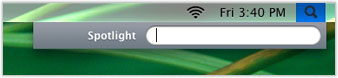
It’s an absolute interface abomination on at least three counts:
- the menu bar is transparent, which is a pretty bad idea,
- the Spotlight icon is still black despite the menu being selected and
- while the actual menu highlight is blue, the space surrounding the Spotlight field is graphite (I wonder which setting is actually active in the Appearance pref pane)
Such interface anomalies are, of course, to be expected in beta builds of software, I was just so surprised to find this particular one gracing Apple’s website.