Window switching in OS X: It’s fast.

The move from Mac OS 9 to Mac OS X brought about a big change in terms of switching between programs: clicking on one window of a program no longer brought all of that program’s windows to the front. This took the Mac OS a little closer to the traditional MS Windows model of program switching rather than the traditional Macintosh implementation — the difference in switching model can be summarised as window-based in Windows (appropriately) and application-based on Mac OS 9.

Interestingly, at around the same time as the OS X change, Microsoft also made a small move away from their traditional model in Windows XP. In XP, when the task bar becomes full, windows belonging to the same program become grouped together and are represented by only one tab in the task bar — in much the same way as the application-centric OS X Dock, but conditional upon available space.

However, OS X didn’t lose all of OS 9’s application-based heritage. Clicking on a program’s Dock icon still brings all of its windows to the front, as does command-tabbing to a different program. Then, of course, there’s Exposé and a host of keyboard modifiers for each method that just make the whole operation really slick. I think part of that slickness stems from the combination of app-centric and window-centric switching… Anyhow, for reasons I’ll explain at the end, I thought I’d just run through some hints and tips for switching between programs and windows on Mac OS X (which are especially recommended for newcomers to the platform):

The Dock (application-centric)

The Dock is the most obvious way to switch between programs on Mac OS X, but even it has a couple of useful keyboard-modifiers to smooth things along:

  • alt (⌥) clicking on a program switches to it, while simultaneously hiding every other program
  • command (⌘) clicking on a program reveals its location in the Finder.

⌘ tab (application-centric)

Pressing command-tab brings up a semi-transparent head-up display with the icons of all currently running applications. There are a handful of keyboard shortcuts that can be used after releasing the tab key, but with ⌘ still held down:

  • H: hides the currently selected application (with the white border around it)
  • Q: quits the currently selected application
  • Tab: cycles forwards through open applications
  • ~: cycles backwards through open applications (shift-tab also does this, but I find ~ much easier to press)
  • The left and right arrow keys, and indeed the mouse, also allow selection of the program.

When you actually want to switch to the selected program, simply release the command key (or click on the program with the mouse).

Exposé (window-centric)

Exposé allows you to see all open windows simultaneously by pressing F9 (or whatever you have assigned to it in the Dashboard and Exposé preferences pane). Alternatively, you can see just the windows of the current application by pressing F10. Or finally, you can temporarily reveal the Desktop by pressing F11. There are a couple of interesting tips regarding Exposé:

  • You can switch from All windows mode to Application windows mode by either (as you might expect) pressing F10 or by pressing tab. Subsequent presses of tab move through all open applications in Application windows mode. Nifty. Shift-tab moves through in the reverse order.
  • In All windows mode, you can move around the windows using the arrow keys.

⌘ ~ (window-centric)

Finally, this is a great one: press ⌘~ in any program with more than one window open and it’ll switch between the open windows belonging to that program.

So that’s that. Now, you might be asking yourself why I’ve only just written this when all these features have been available since Panther at the latest… Well, my main reason is that last week a Windows-using friend was watching me produce a document in Pages, all the while switching back-and-forth between Safari, Mail, Aperture, Photoshop and Finder using a combination of the above methods. They were clearly so impressed that they felt the need to comment on how quickly I was managing to piece together the various parts of the document.

This made me realise that the combination of Exposé, command-tab and the Dock allows for a huge amount of flexibility in how you move around the OS X interface and, as noted by my fellow student last week, these choices clearly have a huge beneficial effect on productivity. For that reason I, for one, am definitely looking forward to spaces in Leopard…

Improving the Dock (a little bit)

As Bruce Tognazinni rightly points out, “Apple Sales is in love with the Dock”. He points out many (specifically 9) problems with the OS X Dock but, contrary to his original stance, believes that the Dock should be kept in place, but supplemented with “serious, information-dense tools”. I do agree with the Tog, but at least there is the consolation that at least a few third parties stepped in to help out.

Anyway, I was thinking about how Apple could possibly add functionality to the Dock, but at the same time keep Apple Sales happy and leave the Dock with its current simplicity and aesthetic appeal. And here are a couple of my ideas (excuse the abysmal Photoshopping):


This shows a sub-menu of the window menu item in Safari’s Dock menu. I’ve always thought of tabs as sub-windows and I think it’s a shame they’re not treated as such by Exposé and the Dock. Programs that currently use tabs include pretty much every web browser, Adium, TextMate, iTerm, Preview1 and Pathfinder.

Pre-release screenshots of Leopard show that both iChat and Terminal will join this ensemble in the coming months. So maybe it would make sense for Apple to have a bit of a think about tabs and produce some crazy mash up of NSTabView and NSWindow, such that each instance of “NSTabViewWindow” could advertise its tabs to Exposé and the Dock. I don’t know – I’m not a programmer. But I am a user, and I think this would be a sweet bit of functionality for OS X to gain.

A similar menu could appear when a user right-clicked a tabbed, minimised window. Possibly even showing a graphical representation of the contents of each tab, which leads me neatly on to my next idea…


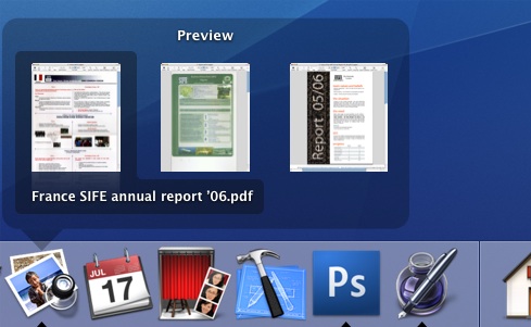
I think this one’s pretty self-explanatory. This window selection interface would appear upon mousing over the Dock icon of a running program, revealing all of its available windows in a ⌘-tab-style interface. Clicking on one would bring it to the front, un-hiding the application if necessary.

So that’s all the images for now. However, I would also like to add two extra features to the Dock that I didn’t feel required a illustration:

1. Allow minimised windows to be closed through their contextual menus (in programs other than the Finder!)
2. Allow for persistent app-specific contextual menu items (e.g. it would be nice if the list of Pref panes in System Preference’s context menu were still there even when System Preferences wasn’t open)

I’m sure there are many many other enhancements (including spring loaded folders – apparently coming in Leopard) that could be made, but I reckon these would be a great start.

1Kind of. If you open multiple images in Preview at the same time, they are “quasi-tabbed” in the drawer at the side of the Preview window.

The “lozenge” button

Apple recently posted a useful tip on toolbars in programs like Finder, Mail, Preview, Keynote, Pages etc. I’d firstly like to supplement that tip by saying that if you hold down just the command key while pressing the toolbar button, you can cycle through the various display options: text only, icon only and icon+text, all in small and large sizes. Shift+command cycles in the reverse order.

Exciting stuff. However, that’s not the point of this post. No no no. Instead, I’m going to have a big rant about toolbars in OS X. Take a look at this screenshot:

Here we see (from top to bottom) iTunes, Mail, Finder, TextEdit, Firefox, Address Book, Safari and Preview. All of them, as you can see, have got a toolbar of some description, but this screenshot really demonstrates how “diverse” toolbar design has become in Mac OS X. We have unified metal in iTunes, unified Aqua with “bubbly” buttons in Mail, old school metal in the Finder, Aqua in TextEdit, an absolute abomination in Firefox, a bit more metal in Address book and Safari and then pure Aqua in Preview. I don’t really know what to call all of these, but it’s clearly a mess.

Anyway, this still isn’t the focus of this post. The real focus is on those massively inconsistent toolbars. First a bit of background…

When Apple first demoed Mac OS X Developer Preview 4, they had put a stupid purple button at the top right of every window. Clicking this put the operating system in “single window mode”, which did exactly what it said on the tin — only one window would show at any one time. This was horrible and had thankfully disappeared by the time the public beta arrived. However, as if somehow Apple’s UI fairies just had to put something in that top right corner, a mysterious new button appeared there in 10.0.

This new button was very odd, it could be found in some applications, but not in others. What did it do? Why was it there? Well, it turns out that, in (some) programs with toolbars, it revealed or hid the toolbar at the top of the window.

What?! A button whose visibility is dependent upon the application in question? In the window title bar?! Correct. The formerly sacred title bar area had been polluted with a button whose function should probably have been relegated to a “View” menu or similar. Sadly, this lozenge-like button has stayed with us since 10.0 and its functionality has remained the same. Or has it?

As you can see in the screenshot, only four of the eight programs have the lozenge button in the window title bar (Mail, Finder, Firefox and Preview). Now this is pretty inconsistent, but it gets worse if you look at the functionality of the toolbar buttons in each case – I would say it only functions as expected in Mail and Preview.

In the Finder, the button almost functions as expected, but 1) the command-shift click keyboard shortcut doesn’t work and 2) when you press it with no keyboard modifiers, the toolbar does disappear but the window also changes from brushed metal to Aqua! What? How does this functionality belong here? What were the UI designers thinking when they implemented this? I cannot imagine.

Admittedly Apple isn’t at fault in the case of Firefox, which has its own cross-platform issues to contend with, but it’s worth a mention all the same: in Firefox, pressing the button does make all toolbars disappear (including those provided by plug-ins), but it does so with no animation (as would be provided by NSToolbar). Furthermore, none of the keyboard modifiers work and, worst of all, when you you select the View>Toolbars>Cutomize option in the menubar, a whole world of UI hell breaks loose. The interface for customising the toolbar clearly tries to look like Apple’s interface, but fails on all counts and could have been better designed by a five-year old. Dog. With severe visual impairment. And no limbs.

So that covers those four. What about the four apps that don’t have the lozenge button? iTunes, TextEdit and Address Book offer no customisation of their “toolbars” whatsoever. I think I know the reasoning behind this from Apple’s point of view. In iTunes, one of Apple’s flagship programs (and yet one of its most offensive), they probably use the same argument as they do against theming in OS X – it would introduce inconsistency between different copies of the application (Windows and OS X). But if that is the case, it’s a bit weak.

The iTunes toolbar contains controls similar to those in the Finder, such as View and Search, so why not allow user customisation? I’d like to see provision for quick access to the graphic EQ, amongst other standard toolbar controls like the Print and Inspector buttons (as found in iWork, for example).

Now, I realize that in OS X terminology, TextEdit is displaying a “Ruler”, not a toolbar, but why not allow customisation of that as well? The Styles, Spacing and Lists menus all look like they belong in a toolbar, as does the alignment button bar. Maybe it’s overkill, but maybe it’s not. The Format>Text menu already contains a “Show Ruler” command, so why not just add a “Customise Ruler” command as well?

Address Book certainly seems like a prime candidate for a proper toolbar, again having items similar to those in the Finder. Here, at least Print and Email buttons wouldn’t go amiss and maybe an “Add field” dropdown menu would be nice for quick access.

Now finally, what of Safari? Personally, I think that of the eight apps I’ve mentioned here, Safari comes closest to doing the toolbar “right” because it doesn’t have a lozenge button, but does allow for customisation of items and their order on the toolbar though the View menu. The only place where it falls down is the lack of provision for labelling the items and changing their size. I’m not sure whether Safari uses NSToolbar, a subclass thereof, or something completely different, but in my opinion, it’s a good thing that it lacks the lozenge and yet still provides a fairly standard customisation dialogue which can be accessed from a logical place.

So basically, I would like rid of that horribly inconsistent lozenge button, but would love to see more uses of NSToolbar around Mac OS X. It’s pretty good; the user can select how much screen space it takes up, it animates nicely and provides a sensible interface for customisation. You can even reorder the items in the toolbar without having the customisation dialogue box open – just hold down command and drag the buttons around (except for the homepage button and forward/back buttons in Safari, but that’s a rant for a different article).