For a new work project, we’ve just been provided with a Kaplan-Meier curve showing kidney graft survival over 12 months in two groups of patients. As the data is newly generated, we don’t yet have access to the raw data and there are too many patients in the samples to see any discrete steps on the K-M curve, meaning that we can’t extract data on time to individual events. Since we wanted to get a rough idea of how our budget impact analysis (the main focus of the project) might look with these data in place, we traced the data from the K-M curve using WebPlotDigitizer by Ankit Rohatgi.
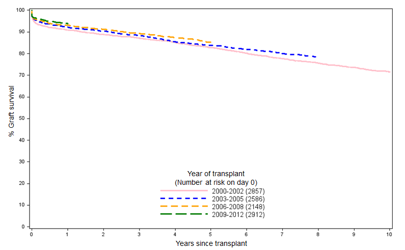
Looking at the shape of the data we had and knowing that longer-term kidney graft survival (from donors after brain death) typically looks like that in Figure 1, we opted for a simple logarithmic model of the data:
$$S(t) = \beta ln(t) + c$$
It’s very easy to generate a logarithmic fit in Excel by selecting the “Add Trendline…” option for a selected series in a chart, selecting the “Logarithmic” option and checking the “Display equation on chart” and “Display R-squared value on chart”. The latter options display the coefficient and intercept values, and the R-squared value (using the Pearson product-moment correlation coefficient), respectively.
However, since we’re ultimately going to be using R for the analysis (when the raw K-M data become available and we use the R survival package to fit a Weibull model, or similar, to the data), I thought it would make sense to also use R to give us our rough logarithmic fit of the data. As one might expect, it’s very straightforward to replicate the results that are produced in Excel using just a few lines of R:
t <- c(1, 2, 3, 4, 5, 6, 7, 8, 9, 10, 11, 12, 13)
survival <- c(1, 0.97909, 0.97171, 0.96186, 0.95694, 0.95387, 0.95264, 0.9520, 0.94956, 0.94526, 0.94279, 0.94033, 0.94033)
s_t <- data.frame(t, survival)
log_estimate <- lm(survival~log(t), data=s_t)
summary(log_estimate)
Running this gives the following output, which tallies exactly with the intercept, log(t) parameters and R squared values reported in Excel for the same data:
Residuals:
       Min         1Q     Median         3Q        Max
-0.0033502 -0.0016374  0.0000542  0.0014951  0.0037662

Coefficients:
             Estimate Std. Error t value Pr(>|t|)
(Intercept)  0.996234   0.001636  609.13  < 2e-16 ***
log(t)      -0.022377   0.000868  -25.78 3.46e-11 ***
---
Signif. codes:  0 ‘***’ 0.001 ‘**’ 0.01 ‘*’ 0.05 ‘.’ 0.1 ‘ ’ 1

Residual standard error: 0.002302 on 11 degrees of freedom
Multiple R-squared: 0.9837,	Adjusted R-squared: 0.9822
F-statistic: 664.6 on 1 and 11 DF,  p-value: 3.458e-11
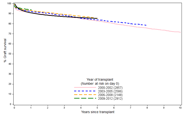
And if we overlay the resulting curve over the NHSBT data in Figure 1, we can see that the simple logarithmic fit matches the clinical reality pretty well when projected over a five-year time horizon:
We can then use this approximation of the K-M curve to derive a survival function that we’ll use in the model until we have access to the full data set. A nice, quick approach that certainly couldn’t be accused of overfitting.