Google has just announced Google Desktop for Mac. Being from Google, it is in beta (even though the version number is, bizarrely, 1.0.0.155). Also, the Mac version certainly does not have feature parity with the Windows version. Notable features that are missing include the Sidebar, any Google Gadget support, advanced search, the ability to lock down searches and the “Floating Deskbar”. So it’s not really in same league as the Window’s version at this point in time. Perhaps the lack of “Gadget” support indicates that Google thinks Spotlight is crap, but Dashboard is pretty good, so didn’t bother competing on that front. Who knows?
So what does the whole thing do? Well, when you first download it, you’re actually downloading a 1 Mb installer (“Google Updater”) that doesn’t just want to install Google Desktop, but also tries it on with Google Earth, Google Notifier and, presumably, if I’d let it run its course, Picasa Uploader. I think this is particularly obnoxious behaviour from Google. The worst part is that I already have Google Earth installed but, because it’s in /Applications/Google/ rather than just /Applications/, Updater didn’t detect it and tried to download it again. At this point, I tried to quit the installer and was presented with this rather horrifying dialog:

So, let me get this straight. I have two options 1) Watch you (Google, that is) continue installing a program I already have or 2) Let you do it secretly. What a choice — it’s a tough one.
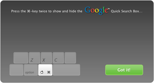
So after this pretty abysmal start, things picked up a little (aside from the ever-present Beta label and lack of feautres). After installation, I was presented with a rather helpful dialog, explaining that all I had to do to use Google Desktop was to press the command (⌘) key twice:

After confirming that I had indeed “Got it!”, I was presented with the main head-up interface to Google Desktop, which is beautiful in its simplicity:

Pretty nice. Certainly as simple as the Spotlight interface. The Preferences link at the top right takes you to a pane in System Preferences — fair enough. It is, after all, a system-wide service and can run as a “faceless” process in the background. As you can see in the bottom right of the above image, Desktop was at the time hard at work indexing my hard drive (a process that took around an hour in my case for ~100,000 files). Rather nicely, it’s possible to perform a search while indexing is in progress, although obviously the results are incomplete…
At this point, I just waited until it had finished indexing before actually starting to use it. Once it had finished indexing, I ran a quick ps auxc | grep Google out of curiosity to see what was going on behind the scenes. To my surprise, this revealed 8 processes, as shown here:

Now, I don’t actually know what all of these are doing, but there seems to be an almost comical level of redundancy between the processes. For example, what are all these doing: GoogleUpdateInstaller, Google Update Helper, GoogleUpdateDownloader and GoogleUpdateChecker? Weird. Also, what’s the difference between a Daemon and an Agent? Though I’m probably just being ignorant not knowing the answer to that one…
So far, so interesting. Now, in terms of features, the obvious comparison is between Google Desktop and Spotlight. On this front, Google Desktop looks fairly promising. My feeling (i.e. without any formal testing) is that Desktop is marginally faster than Spotlight (on my 17-inch MacBook Pro 2.33 GHz). It also has the option to present more information than the Spotlight menu does in the form of file-paths or “snippets” from mail messages, HTML files etc. However, Desktop does seem to ignore Spotlight’s preferences for the order in which search results appear (and presents no equivalent option in the preferences). When I search for “iPhoto”, for example, the first hit with Spotlight is iPhoto.app, whereas with Desktop, the first hit is the iPhoto Getting Started Guide — not really something I want to open on a regular basis.
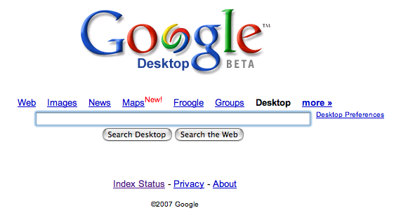
Another feature of Desktop is its integration with your web browser. Once you’ve restarted Safari, you can access the Google Desktop homepage from a multiplicity of places: the Desktop menu bar item, its Dock icon or by heading to google.com and clicking on a new item above the search box: Desktop. All of these take you to 127.0.0.1:9115, which looks like this:

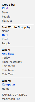
As you probably already know, this allows you to search for local content through the web browser. Through this interface, I’d say Desktop surpasses Spotlight in some regards, but not others. For example, it allows for searching of web history and will show you a small graphical preview of each page in the results. Also, cached email messages can be viewed within the browser with no need to switch to Mail, which is pretty nice. But Spotlight wins in terms of filtering down your results. Desktop gives you the option to show everything or just any of the following types: email, web history, files, media or “others”. Then it gives you the option to sort by either date or relevance and whether you would like a partial or exact match of the search term. These options are fairly limited compared with Spotlight, which presents the following options:

Desktop also allows for searching of Gmail accounts, which is neat (although it takes an age to index the messages) and, crucially, allows a Google search to be launched by pressing ⌘ ⌘ “Search term” Up-arrow Return. This can be done from any app and is definitely a bonus of installing Desktop, especially if you don’t already have Quicksilver configured to do something similar.
So all-in-all, Google Desktop is pretty average. It’s in beta (although admittedly I haven’t had any issues with it thus far), it doesn’t offer feature parity with the Window’s version, it isn’t better than Spotlight in all regards and the installer is horrible. But, on the plus side, it does offer a couple of nice new features, notably Gmail search, system-wide Google search and web history search with graphical previews. I’ll be leaving it installed for the moment, especially as it’s a pretty “passive” program — it runs in the background and hasn’t taken over any of my keyboard shortcuts, so why not? I think Spotlight in Leopard is introducing system-wide web searching, and Quick Look will give us rich graphical previews of every file but, for the moment, I think Google Desktop will make some contribution to my daily Mac-using life.