Apple recently posted a useful tip on toolbars in programs like Finder, Mail, Preview, Keynote, Pages etc. I’d firstly like to supplement that tip by saying that if you hold down just the command key while pressing the toolbar button, you can cycle through the various display options: text only, icon only and icon+text, all in small and large sizes. Shift+command cycles in the reverse order.
Exciting stuff. However, that’s not the point of this post. No no no. Instead, I’m going to have a big rant about toolbars in OS X. Take a look at this screenshot:

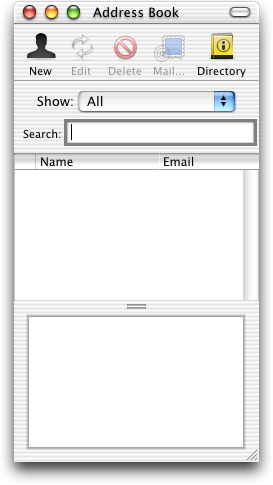
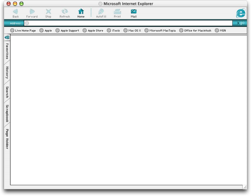
Here we see (from top to bottom) iTunes, Mail, Finder, TextEdit, Firefox, Address Book, Safari and Preview. All of them, as you can see, have got a toolbar of some description, but this screenshot really demonstrates how “diverse” toolbar design has become in Mac OS X. We have unified metal in iTunes, unified Aqua with “bubbly” buttons in Mail, old school metal in the Finder, Aqua in TextEdit, an absolute abomination in Firefox, a bit more metal in Address book and Safari and then pure Aqua in Preview. I don’t really know what to call all of these, but it’s clearly a mess.
Anyway, this still isn’t the focus of this post. The real focus is on those massively inconsistent toolbars. First a bit of background…
When Apple first demoed Mac OS X Developer Preview 4, they had put a stupid purple button at the top right of every window. Clicking this put the operating system in “single window mode”, which did exactly what it said on the tin — only one window would show at any one time. This was horrible and had thankfully disappeared by the time the public beta arrived. However, as if somehow Apple’s UI fairies just had to put something in that top right corner, a mysterious new button appeared there in 10.0.
This new button was very odd, it could be found in some applications, but not in others. What did it do? Why was it there? Well, it turns out that, in (some) programs with toolbars, it revealed or hid the toolbar at the top of the window.
What?! A button whose visibility is dependent upon the application in question? In the window title bar?! Correct. The formerly sacred title bar area had been polluted with a button whose function should probably have been relegated to a “View” menu or similar. Sadly, this lozenge-like button has stayed with us since 10.0 and its functionality has remained the same. Or has it?
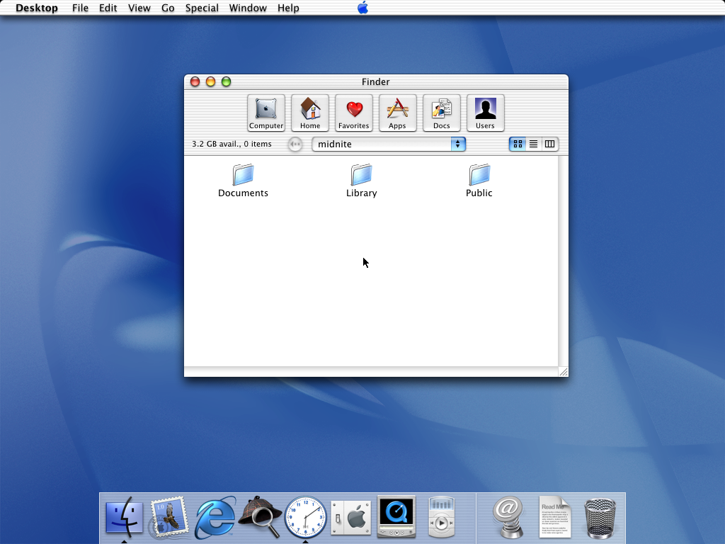
As you can see in the screenshot, only four of the eight programs have the lozenge button in the window title bar (Mail, Finder, Firefox and Preview). Now this is pretty inconsistent, but it gets worse if you look at the functionality of the toolbar buttons in each case – I would say it only functions as expected in Mail and Preview.
In the Finder, the button almost functions as expected, but 1) the command-shift click keyboard shortcut doesn’t work and 2) when you press it with no keyboard modifiers, the toolbar does disappear but the window also changes from brushed metal to Aqua! What? How does this functionality belong here? What were the UI designers thinking when they implemented this? I cannot imagine.
Admittedly Apple isn’t at fault in the case of Firefox, which has its own cross-platform issues to contend with, but it’s worth a mention all the same: in Firefox, pressing the button does make all toolbars disappear (including those provided by plug-ins), but it does so with no animation (as would be provided by NSToolbar). Furthermore, none of the keyboard modifiers work and, worst of all, when you you select the View>Toolbars>Cutomize option in the menubar, a whole world of UI hell breaks loose. The interface for customising the toolbar clearly tries to look like Apple’s interface, but fails on all counts and could have been better designed by a five-year old. Dog. With severe visual impairment. And no limbs.
So that covers those four. What about the four apps that don’t have the lozenge button? iTunes, TextEdit and Address Book offer no customisation of their “toolbars” whatsoever. I think I know the reasoning behind this from Apple’s point of view. In iTunes, one of Apple’s flagship programs (and yet one of its most offensive), they probably use the same argument as they do against theming in OS X – it would introduce inconsistency between different copies of the application (Windows and OS X). But if that is the case, it’s a bit weak.
The iTunes toolbar contains controls similar to those in the Finder, such as View and Search, so why not allow user customisation? I’d like to see provision for quick access to the graphic EQ, amongst other standard toolbar controls like the Print and Inspector buttons (as found in iWork, for example).
Now, I realize that in OS X terminology, TextEdit is displaying a “Ruler”, not a toolbar, but why not allow customisation of that as well? The Styles, Spacing and Lists menus all look like they belong in a toolbar, as does the alignment button bar. Maybe it’s overkill, but maybe it’s not. The Format>Text menu already contains a “Show Ruler” command, so why not just add a “Customise Ruler” command as well?
Address Book certainly seems like a prime candidate for a proper toolbar, again having items similar to those in the Finder. Here, at least Print and Email buttons wouldn’t go amiss and maybe an “Add field” dropdown menu would be nice for quick access.
Now finally, what of Safari? Personally, I think that of the eight apps I’ve mentioned here, Safari comes closest to doing the toolbar “right” because it doesn’t have a lozenge button, but does allow for customisation of items and their order on the toolbar though the View menu. The only place where it falls down is the lack of provision for labelling the items and changing their size. I’m not sure whether Safari uses NSToolbar, a subclass thereof, or something completely different, but in my opinion, it’s a good thing that it lacks the lozenge and yet still provides a fairly standard customisation dialogue which can be accessed from a logical place.
So basically, I would like rid of that horribly inconsistent lozenge button, but would love to see more uses of NSToolbar around Mac OS X. It’s pretty good; the user can select how much screen space it takes up, it animates nicely and provides a sensible interface for customisation. You can even reorder the items in the toolbar without having the customisation dialogue box open – just hold down command and drag the buttons around (except for the homepage button and forward/back buttons in Safari, but that’s a rant for a different article).

